An assortment of some of the logos I’ve done over the years.

Hugalug
Men’s hygiene brand featuring soaps and skincare products.
Badroads Offroad
A fairly new off-road aftermarket wheel brand.


Heaven’s Gate
This bar is now closed, but I still like the typography.

Britstar
DJ Britstar logos. One heavily shaped after Barbie. The other planned for media flyers.

Gaston’s
Traditional New Orlean’s Cajun grill restaurant.
Zero Gravity
A skatepark with its own brand of merch.


Jeep Icon
Less of a logo and more of a branding icon for Hardrock Offroad Wheels.

Zen Monkey
A seasonal chocolate and banana infused microbrew.


Wild
Shop focusing on lightweight camping for hikers, survivalists’ and outdoorsmen.
Fineapple
A quick logo for a dj friend.


Lioness
Avatar and gravatar icons for gamer Lady Leo.
Hydrip
An alkaline water service.
The Design Approach
I truly enjoy the logo design process. Creating a visual representation of a brand can be a very fulfilling experience. Whether a logo represents individuals, products or a companies, there is a story to tell.
Finding a timeless way to visually associate this story is the goal of every logo. There are graphic design elements that help in this process. These work in tandem with identifying the story of the brand. When done right a clean and simple design can be created that can endure.
Revisiting Aged Logos
There is always a need for new logo design. That holds especially true for individual branding and small startups. However, a large amount of the logo work I do comes from logo cleanup or updating.
A good logo can stand the test of time. Trendy logos feel fresh in the moment, but eventually they tend to feel dated. Most of the time it’s because they’re overly complex or use the wrong font. Sometimes it goes deeper than that, but normally a little tweaking can fix a logo right up.
Working Example
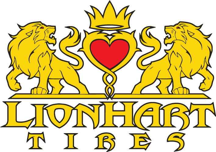
Before
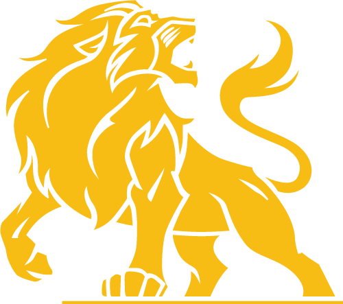
After
Here’s an example of a logo that I worked on for a client. Their existing logo was produced in the mid 2000s when crests and heraldry were all the rage. Even I got caught up in that movement a little. *see Heaven’s Gate above.
The products associated with this logo did well. It worked for them, but they told me they had issues with scale in multiple forms of media. The logo was overly complex. They would still have the logo on most of their past products, but wanted an alternative that would be more flexible in the future.
Borrowing From The Original
This isn’t a complete redesign of their existing logo. It is merely a simplification of the design. I focused on one lion instead of the heraldry. Then I turned it into one solid color. This involved removing the outlines and widening the gaps.
The type is sometimes stacked with the lion, but it had previously functioned well enough on its own. By making the graphic a single lion without text, it has the freedom to float independently within the media of choice.
The yellow was darkened a little so that it reads better on light colors. In this form the lion can also be switched to black, white or shades of gray giving it more flexibility.
As is sometimes the case, the transition to the new logo hasn’t been immediate. It’s been a few years and the legacy logo often remains a viable solution for them. When you have clients that aren’t always 100% on-board with change, a simplification can work much better than a full redesign.
